Fremont Insurance
For more than 140 years, Fremont Insurance has helped Michigan families and business owners protect their most valuable assets. They are known for their competitive rates, outstanding customer service, and commitment to bettering Michigan communities. With a broad range of insurance products, including auto, home, and business policies, Fremont Insurance has developed a strong reputation as a trusted insurance company.
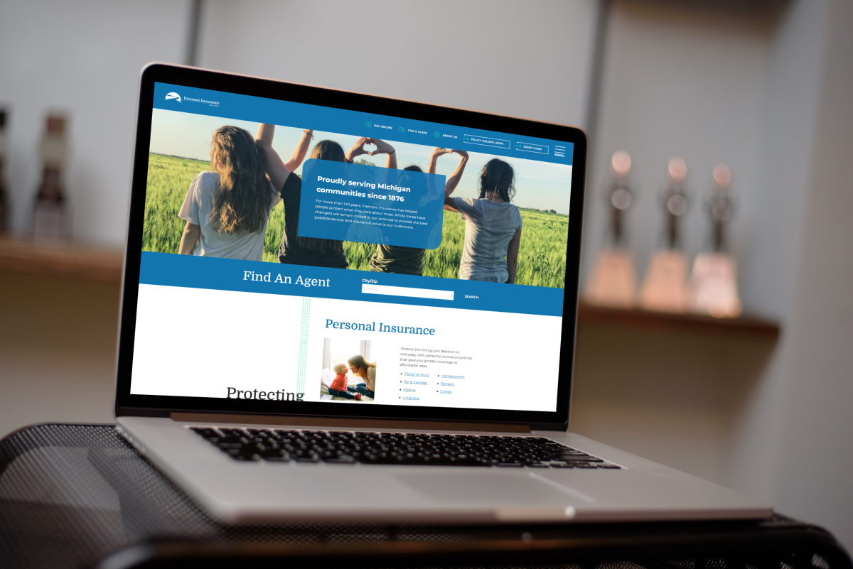
As they prepare to expand their service beyond Michigan, they chose Gravity Works to help them make a strong first impression with their online audience. We redesigned their public-facing website, placing a large focus on improving usability through relevant web content and a polished online experience.

Migrating to Drupal
Fremont needed a way to easily update their web content, especially as they start moving into new service territories. We rebuilt their website on a Drupal content management system to give them more content editing tools and flexibility. The editor interface is clean and intuitive, making it simple to build structured pages using various paragraph types. The platform makes it possible to display tagged content in multiple locations, like blog articles and frequently asked questions. And we were able to give Fremont custom features, like an interactive timeline of their company history.


Putting Content First
A large part of the project scope was dedicated to content strategy and writing. Fremont needed their web content to educate potential customers about their policies and drive traffic to the “Find an Agent” tool. Our content team worked closely with subject matter experts across multiple departments on a site-wide rewrite of their web content.
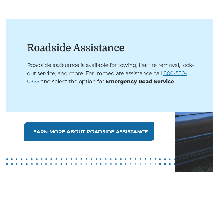
The new content is more relevant and informative, providing detailed descriptions of their insurance products including what’s covered and ways to save. We created an information hub for claims to help policyholders open a claim quickly and understand the claims process, step-by-step. We helped bring awareness to their community efforts, including annual donations and volunteering. Most importantly, call-to-actions are strategically placed throughout the site to encourage users to find an agent and increase their online conversions.
Attracting New Business
As with most B2C websites, the primary goal of the redesign was to bring in new business. Not only was it important to drive traffic to the agent locator tool, the tool needed to be easy to use. We used a Google API to match users with nearby agents. Users enter their city or zipcode into the search field, which then triggers Google Maps to convert the value into a set of geo-coordinates. The data is displayed in map and list view, allowing users to click on a map pin or scroll through the list of results to find contact information for a nearby agent.
Creating a Cohesive Experience
In addition to the public-facing website, Fremont has an agent portal which houses a large collection of insurance documents. Agents log into this portal to access internal information and forms required to perform their work. To give their entire web presence a cohesive look and feel, we rebuilt the portal matching the new styles and branding of the public-facing website. Although the portal’s functionality remains the same, we streamlined the navigation and content to help agents quickly find what they need.


