Ann Arbor Area Transit Authority: TheRide
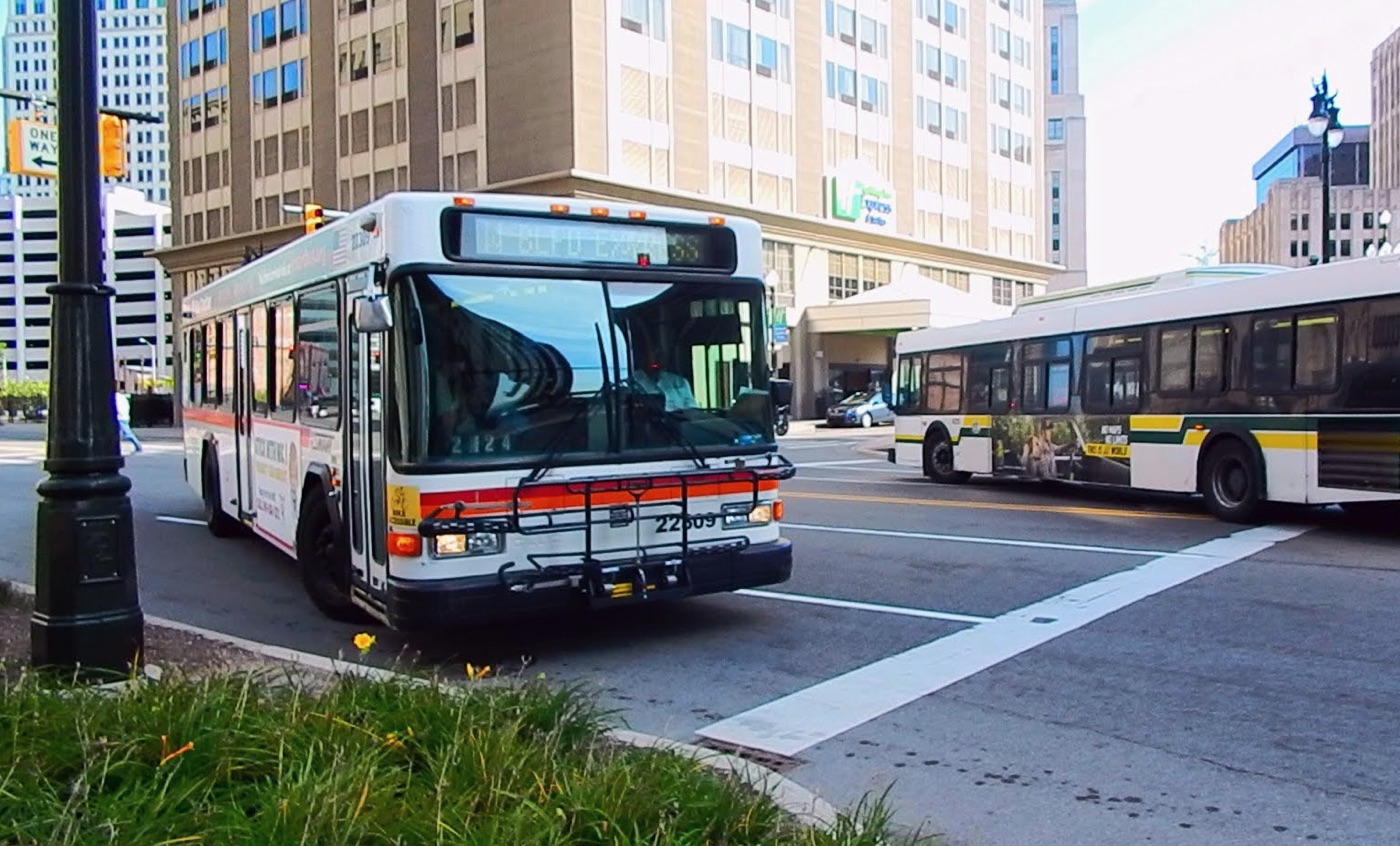
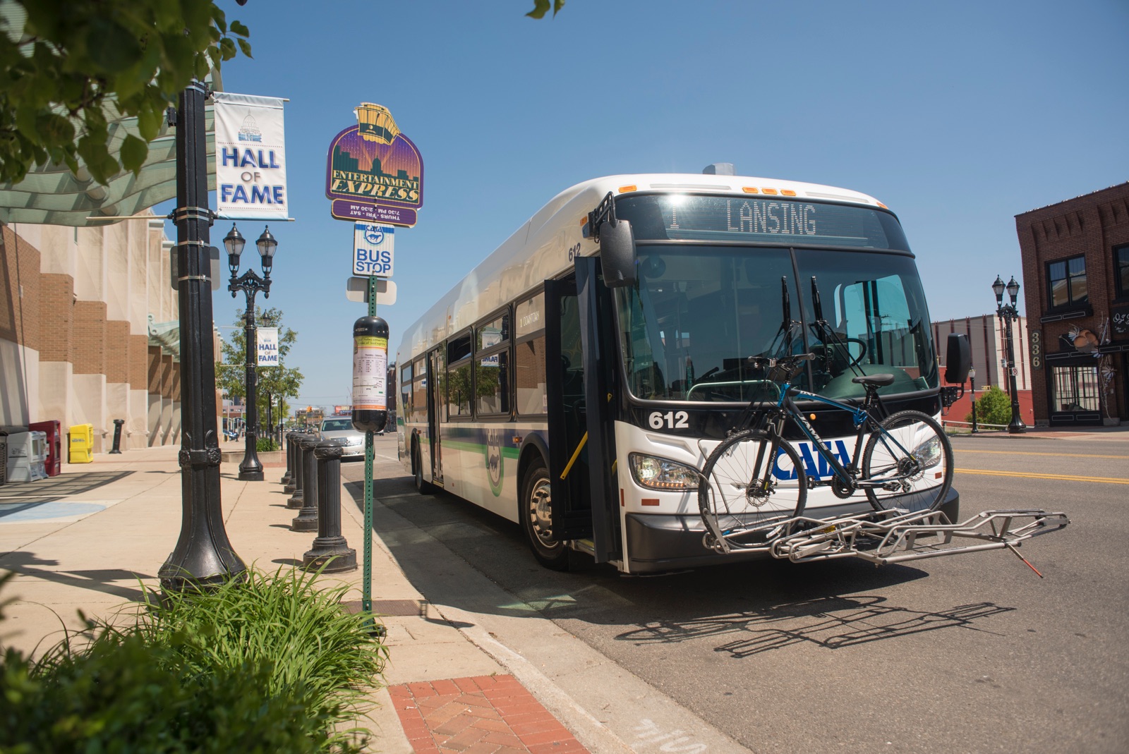
The Ann Arbor Area Transportation Authority (TheRide) is the primary public transportation system in the Greater Ann Arbor-Ypsilanti Area. For more than 50 years, TheRide has provided accessible, affordable, and reliable transportation services to millions of public transit users.
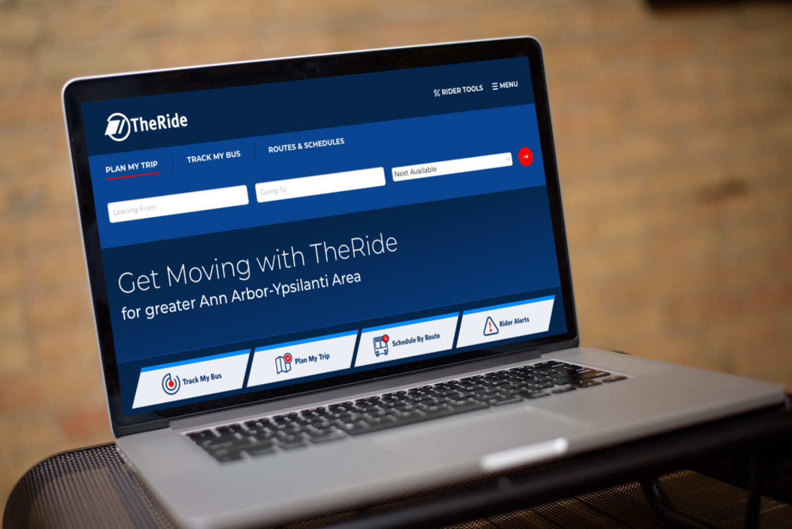
Gravity Works worked closely with TheRide to migrate their existing rider tools to Drupal. We built custom front-end solutions to help their marketing team improve digital communication and connect more effectively with their riders. And most importantly, we created a superior user experience that helps Ann Arbor/Ypsilanti residents use their services to get around.
Solving Problems Using Clean Front-End Solutions
Using Drupal, we gave TheRide control to change content in as many places as possible without touching code. We streamlined the responsibilities of the content editor by following the golden rule of front-end development – content that appears on more than one page should be stored and editable in one spot. This website solves complex problems by applying methodical, clean front-end solutions.
Paragraph Type Variants
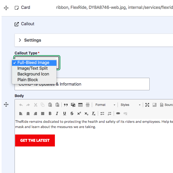
The new website makes it simple for content editors to build attractive web pages with more Paragraph types to choose from. While having options is a good thing, sometimes too many choices can feel overwhelming. To keep it simple, we grouped similar Paragraph types into the same editor experience and added a field for editors to select the style variant they want to use. Now when TheRide wants to add a call-to-action, they are presented with a cleaner, more intuitive set of options.
Mapped Images
TheRide needed a way to pinpoint elements on a map or image and provide details about that particular point, like a commuter lot or a bus stop. We implemented a custom solution that allows content editors to place pins on any image exactly where they need to. Each pin is connected to descriptive text below the image. Content editors can also customize the pin’s label (a/b/c, 1/2/3) and color. The pin’s text color is automatically set to white or black to ensure accessible color-contrast ratios.
Fares Tables
With thoughtful use of Drupal’s taxonomy setup, we made it simple for content editors to display highly-structured data, like fares tables. On the front end, we carry that thoughtful setup onto the user through clean tables, tabbed interfaces, and accordions to limit the information on-screen to what each visitor finds important. We also give extra details (service definitions, rider classification details) as table captions or hidden behind the help icon so users have all necessary information at their fingertips.
Creating a First Class User Experience
Our content and design teams worked closely together to create an intuitive, self-service user experience for riders. We made it simpler for people to access the information they needed to use TheRide’s services, whether it’s looking up the price of a one-way fare or how to travel with a bicycle. Our goal was to make the website a valuable resource that would help riders understand everything TheRide has to offer.
Content Strategy
We conducted a content audit and analysis to become more familiar with TheRide’s content. The analysis helped us identify and remove outdated content that was no longer serving a purpose to their riders or their organization. It also gave us plenty of ideas for how we could improve their content. We took our new ideas and laid out the blueprints for our content strategy.
