Center for Family Health
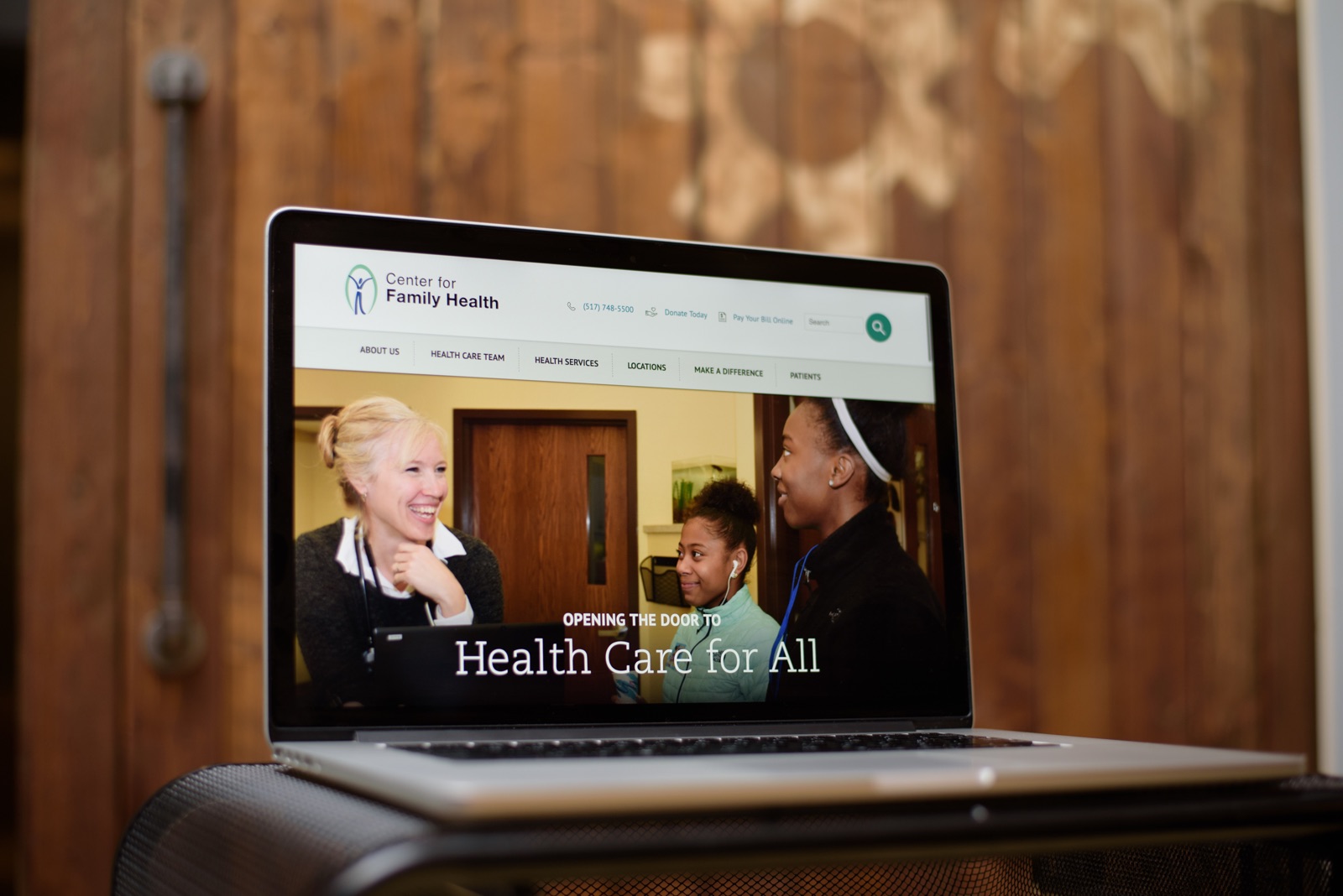
The Center for Family Health (CFH) is an independent health care provider that offers a variety of services to women and families in South Central Michigan. They do important work, like helping people get access to medical, dental and mental health services at an affordable cost. To make their work a little easier, we built an organized, patient-focused website with new administrative tools. Their initial goal–and ours–was to create a no-barrier way for patients to access quality healthcare services.

Results
Our team developed the new site to improve the online experience for both patients and administrators, making their healthcare services more accessible and manageable.
Donations
Staff Directory
Extra Focus on Accessibility
The new CFH website needed to serve a diverse group of staff members and patients. The CFH community consists of people from a variety of backgrounds, including low literacy and multiple-language users. We took great efforts to ensure that the site was easy to navigate, and that tools and information were simple to understand. Gravity Works launched the site with WCAG 2.0 Level A and Section 508 accessibility compliance.

Making Navigation Simple
We worked closely with CFH to identify their target audiences and understand what each specific group would need from the website. A patient seeking services for dental care has a different set of goals than a staff member accessing directory information. So we needed this site to cater to those specific needs.
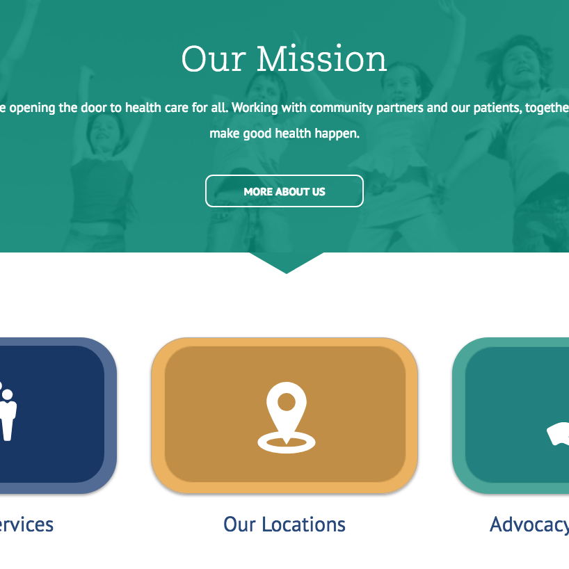
We combined and cleaned up their web content, making it easier to locate and understand information. By observing their Google Analytics trends, we were able to pinpoint which services were the most sought after. We then used those insights to create an information architecture that prioritized those services, featuring them on the homepage.


