Michigan Farm Bureau Family
of Companies
The Michigan Farm Bureau Family of Companies (Farm Bureau) consists of two primary parts – Michigan Farm Bureau and Farm Bureau Insurance of Michigan. Although each part of the company has their own focus, together they have been serving Michigan’s families and farmers for more than 100 years.
As more of their customers look to do business online, they knew they needed a stronger digital platform to continue supporting their needs, as they’ve done for so long. We’ve partnered up with Farm Bureau to guide them through a digital transformation, starting with their public-facing website, with no end in sight. This new website is propelling the Farm Bureau brand forward and establishing them as industry leaders in the digital space.
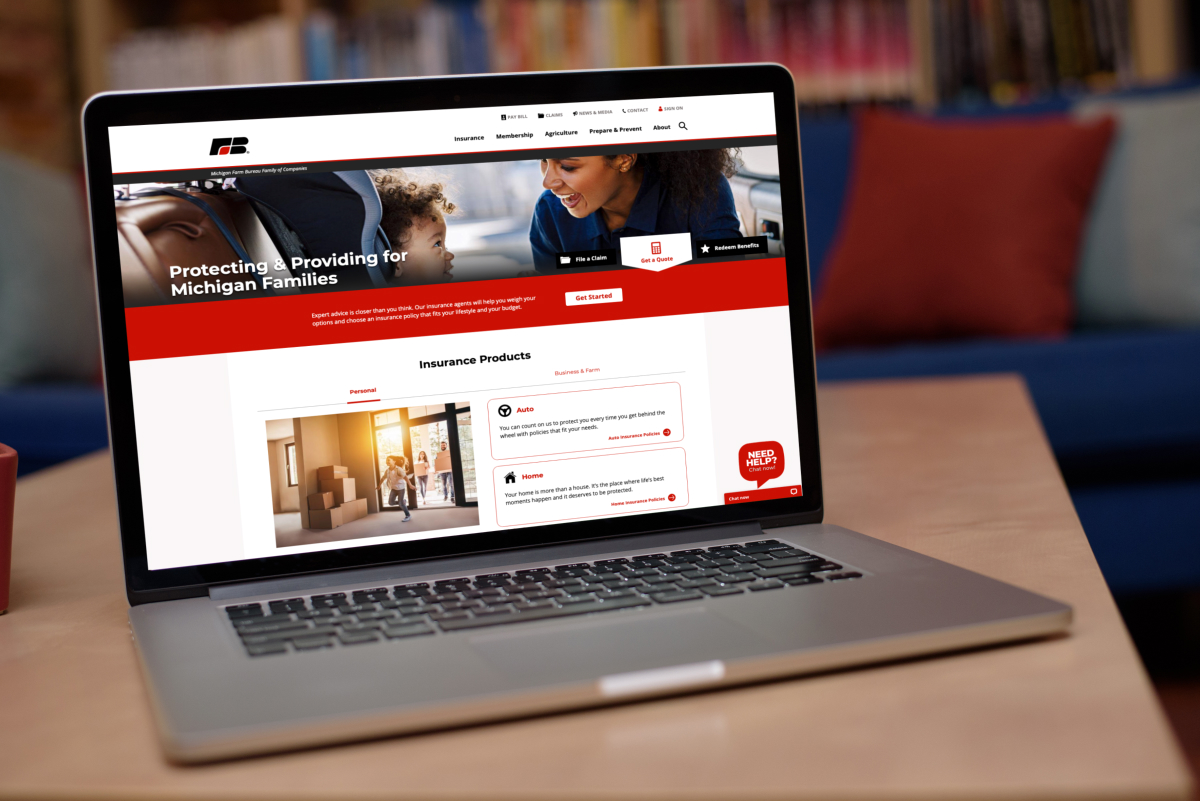
Creating a Unified Brand
One of the largest changes to their web presence is a shared space for the Family of Companies. Instead of managing separate websites like they were previously, Farm Bureau now has one site to represent the company as a whole.
One reason for this shift was to help their customers understand the relationship between both sides of the company and how they work together to offer greater value to their members. This decision also allowed us to create one menu structure, making it easier to find information and explore everything Farm Bureau has to offer.
In our early discovery work, we learned that many insurance customers didn’t understand the full value of their Farm Bureau membership. Some weren’t aware that their membership gave them access to savings and discounts on daily purchases, or that they were contributing toward larger causes in Michigan’s agriculture industry. By creating a unified web presence, we were able to tell Farm Bureau’s full story, not just one side of it.
Testing Our Assumptions
We make UX decisions based on our experience, but it’s all just an assumption until we validate it with the real audience. Throughout this project, we conducted a number of user tests including card sorting, reverse card sorting, and first-click testing with a total of 12,697 participants. These tests gave us the confirmation we needed to proceed with a single website. It also helped us to refine our sitemap, including adjustments to the main menu items, to ensure users could find and use information across the site.
Helping Customers Accomplish More
Content Development
With so many options for buying insurance, it can be difficult for customers to decide who will best meet their needs. We helped Farm Bureau stand out from the competition by showcasing what makes their policies great, so customers can make informed buying decisions.
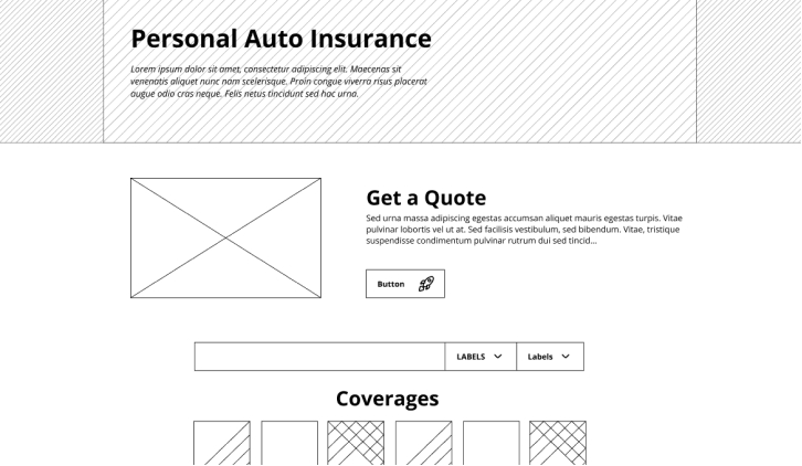
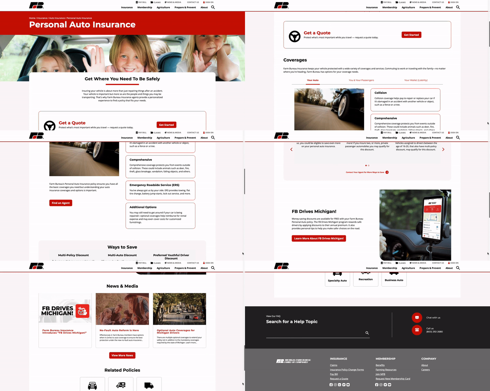
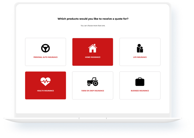
Request A Quote
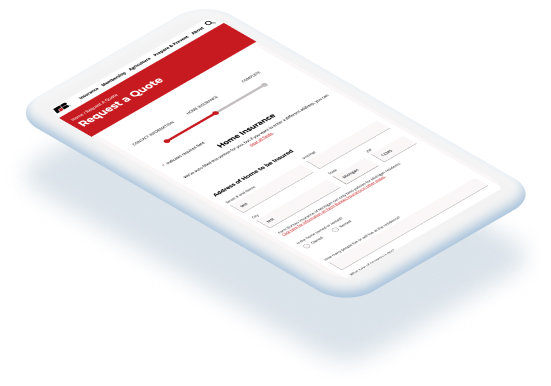
The new website is making it simpler than ever for insurance customers to open new policies with Request a Quote (RAQ) functionality. In the past, users had to request a quote through the website’s chat feature. But relying on live interactions isn’t always convenient, especially for customers who prefer self-service.
With the new RAQ functionality, customers choose which policies they want to receive a quote for and complete a fillable form which collects the information agents need to provide accurate estimates.
The form includes a progress bar, or completeness meter, which updates as the customer moves from page-to-page to indicate how close they are to completing the form. It also includes help text to define certain insurance terms or concepts that may be foreign to the customer, like “Where can I find my VIN number?” or “What’s collision coverage?”. These usability features create a more satisfying experience for the customer and increase completion rates.
The RAQ form also communicates with Salesforce, which places the collected data into a lead database for agents to keep track of customer interactions and tailor their service.
Helping Content Editors Do More
For the Farm Bureau staff tasked with managing the website day-to-day, the most notable change is the CMS platform itself. We moved their team away from their outdated CMS to a Drupal platform that gave them greater content editing control. This transition will allow their content editors to more easily update and publish various types of content including basic pages, news articles, and more.
A robust tagging and taxonomy system allows them to promote relevant content, like related news and products, anywhere across the site. This makes it easier for their marketing team to cross-sell additional insurance products to their customers, like bundling an auto and home policy.
With these enhancements in their toolbox, Farm Bureau can finally communicate with their insurance customers and members the way they want to. By creating a better online experience, they are fulfilling their promise to always work toward improving their service, further building trust with Michigan families.


